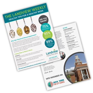
 When your customer is creating an informational flyer, a sales sheet for meetings, or a company newsletter, it’s important that their design guides readers through the information and makes it easy—and enticing—to take the next step. If they come to you for guidance on designing their sales sheets, it’s important that you know how to make their sales sheet effective. Here are our tips for designing a better sales sheet.
1. Start With What You Want Your Flyer to Achieve
No matter how stylish your customer wants their flyer to be, it’s important to remember that every print piece has a purpose. That purpose needs to be the foundation of the design for your customer’s flyer. The information and images on that flyer need to support your customer’s goal, and anything that doesn’t should be left out.
2. Keep Things Easy to Read
Whether your customer wants their sales sheet to be text heavy or wants to let images take the spotlight, it’s important that their text is easy to read. Keep information concise, and choose simple, readable fonts that will make the sales sheet easier to scan.
This goes double for your customer’s contact information. You want anyone reading their flyer to be able to find this information as easily as possible, whether that means putting their web address in a bold font or leaving white space around that information to ensure that it is easy to pick out among the other text on the flyer.
3. Short on Space? Make a Grid!
One of the easiest ways to make a flyer readable and easy-to-navigate is to make it in a grid. Not only does using a grid make it easier to budget your space during the design process, it also is a style your customer will be familiar with and that will make it easy for them to quickly read and absorb the information.
And if your customer wants to change things up, consider placing that grid at an angle, tilted slightly. You will still have the easy organization and readability, but the angle will add a touch of visual interest.
4. Add Color
When your customer wants to create an informational piece, color is key! Use blocks of color to emphasize text or important ideas, use one or two photographs to add visual interest, or use your customer’s brand colors to add a splash of recognizable color. Color is a great way to reinforce the message of the sales sheet and make it more entertaining to read.
5. Have a Call to Action
What’s the next step? You don’t want readers to have any doubts about what to do next once they’ve read the sales sheet. Highlight your customer’s website, an “order today!” message, or other information to make that next step clear.
What do you think makes an effective sales sheet? We’d love to see you join the conversation in the comments below.