4 Tips For Perfect Poster Design

Whether your customer is looking for a way to promote their event in the community, wants to create posters to inform their clients about special offers or summer sales, or simply wants to create more striking décor for their space, poster design can be a challenge. When you are called upon to help them create a design for their upcoming event or promotion, use these four tips to create a striking poster design.

1. Stick to the Most Important Information
A poster might be a large print piece, but that doesn’t mean you should cover every inch with information. A good poster gets its message across clearly, and the best way to do that is to focus on a small amount of information. For example, if your customer is using their poster to promote a fundraiser, their poster should include the essential information: what kind of event it is, when and where it will be held, and other essential information like sale details or ticket prices.

This goes double when a poster is going to be displayed on a crowded bulletin board or in a busy space. If the people reading it only have a moment to see what it says, focusing on the information that is most important will ensure that it is memorable even in a busy location. And speaking of location…

2. Keep Location in Mind
Is the poster you are designing going to go in a specific place? It’s important to keep that location in mind. If the poster is going to be displayed on a community bulletin board, for example, you’ll want to create an eyecatching design that will capture attention. If it’s going to be displayed in your customer’s place of business or at their event, they might want to create something that matches their brand or event décor.

3. Use Your Colors
With full color print, the options for color on your customer’s poster are nearly endless. That’s why color is one of the most useful tools in creating an effective poster design. Your customer can use bright colors to add energy and excitement to their sale, use seasonal colors to highlight a seasonal event—think red, white, and blue for the Fourth of July—or use high contrast colors for a more readable design.

4. Take a Step Back
Think about where you see posters. Sometimes you walk right up next to them, but sometimes you see them from across the room. That’s why a poster should be as visually impactful from a distance as it is from nearby. No matter what your customer’s poster is for, it’s important for that poster to be appealing from a variety of vantage points. Don’t get bogged down with the little details as you design—take a step back, too!

Do you have more tips for designing a great poster? We’d love to hear your suggestions in the comments below.
4 Reasons to Consider Raised Foil

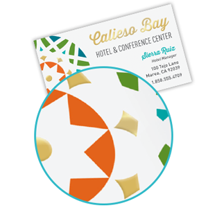
A few weeks ago we told you about what spot gloss print can do, and now we want to introduce you to raised foil! Raised foil is a versatile addition to your customers’ print pieces that is sure to attract attention. Here are four reasons they should consider adding raised foil to their next business card, announcement, or postcard order.

1. More Color for More Creativity
We debuted raised foil with nine different colors to choose from because we understand that more options allow you to connect with more customers. With classic gold and silver metallic—shiny or dull—and a variety of other colors including eye-catching silver holographic foil, your customer has the variety of foil colors they need to create just the look they’re looking for.

And speaking of color…

2. Bring the Shine of Foil to Full Color
Does your customer love the versatility of full color but want the elegance of foil? Do they want to bring their favorite foil style to new heights? Do they want to give their full color brand style an upgrade? Raised foil is a great way to do just that. Because raised foil is paired with full color print, your customer has a broad palette of color to play with in both foil and ink. They can add foil accents to full color images, add foil text to vibrant photographs, and much more.

3. Foil with Fine Detail
Not only does raised foil give your customer a variety of options for color, it also gives them a variety of options for design. Whether they are looking for bold foil designs or fine detail, raised foil delivers. If you want to know more about the best ways to design for raised foil, take a look at this design guide for more information.

4. You Can Be Sure of Your Design
We understand that these new print processes can be daunting—that’s why we offer the opportunity for you to order a single business card, announcement, or postcard. This allows you to check a printed proof of the design for a small fee before committing to your order, and it allows you to adjust the design as needed for a small additional fee for each proof.

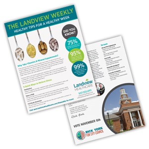
Want to promote this print process to your customers? We’ve created this flyer to help you show off what raised foil print can do. And, when you’re ready to order, you can order either through our catalog or on Navitor.com.

What do you like best about raised foil? We’d love to see you join the conversation in the comments below.

Your How-To Guide for Enhanced Finishes

You’ve heard about Navitor’s new enhanced finishes products—are you ready to design them? Today we’re taking you through how to create enhanced finishes files, step by step.

1. Know Your Resources!
We know it can be daunting to create the designs for our enhanced finishes products at first—that’s why we have created a few resources that could help you navigate the design process more effectively. If you want to spend some time getting to know the process, we recommend visiting our website for downloadable file creation tutorials.

You can also use these documents with your customers when they are creating their own designs. The unbranded documents feature all of the file requirements for each print process, making them an excellent option for customers who want to get hands on with the design process themselves.

Are you more of a visual learner? We’ve got you covered there, too—watch this video created by one of our graphic designers to see the process step by step!

2. Download Your Enhanced Finishes Swatch Library
Ready to get started? Start by downloading the swatch library from the Enhanced Finishes page on Navitor.com.

3. Open Your Full Color Design and the Enhanced Finishes Swatch Library
A full color design is the foundation of your enhanced finishes design, so start with that full color design. Then, once the base design is ready to go, open up the swatch library you downloaded in step two.

how to design enhanced finishes spot uv gloss, raised gold silver foil, raised spot ultraviolet gloss

4. Create a New Layer For Enhanced Finishes
Whatever design elements you want to bring spot gloss, raised spot gloss, or raised foil to, create a new layer and place them there. Next use one of the various enhanced finish swatches to color the elements then from attributes set them to “Overprint Fill” so they receive the enhanced finish.

5. Create Your Press File
Your design is ready to go! Double-check to ensure that your file will be created using CMYK color and export the file!

6. Still Not Sure? Order One.
We know that you might want a bit of extra practice before you are ready to place your full order, which is why we offer you the option to order a single print piece. This press proof gives you the chance to review your design for a small fee and adjust as needed.

What do you love most about our new enhanced finishes business cards, announcements, and postcards? We’d love to see you join the conversation in the comments below.

5 Tips for Designing a Better Sales Sheet

designing a better sales sheet, flyer, personalized printed newsletter, full color sell sheetWhen your customer is creating an informational flyer, a sales sheet for meetings, or a company newsletter, it’s important that their design guides readers through the information and makes it easy—and enticing—to take the next step. If they come to you for guidance on designing their sales sheets, it’s important that you know how to make their sales sheet effective. Here are our tips for designing a better sales sheet.
1. Start With What You Want Your Flyer to Achieve
No matter how stylish your customer wants their flyer to be, it’s important to remember that every print piece has a purpose. That purpose needs to be the foundation of the design for your customer’s flyer. The information and images on that flyer need to support your customer’s goal, and anything that doesn’t should be left out.

2. Keep Things Easy to Read
Whether your customer wants their sales sheet to be text heavy or wants to let images take the spotlight, it’s important that their text is easy to read. Keep information concise, and choose simple, readable fonts that will make the sales sheet easier to scan.

This goes double for your customer’s contact information. You want anyone reading their flyer to be able to find this information as easily as possible, whether that means putting their web address in a bold font or leaving white space around that information to ensure that it is easy to pick out among the other text on the flyer.

3. Short on Space? Make a Grid!
One of the easiest ways to make a flyer readable and easy-to-navigate is to make it in a grid. Not only does using a grid make it easier to budget your space during the design process, it also is a style your customer will be familiar with and that will make it easy for them to quickly read and absorb the information.

And if your customer wants to change things up, consider placing that grid at an angle, tilted slightly. You will still have the easy organization and readability, but the angle will add a touch of visual interest.

4. Add Color
When your customer wants to create an informational piece, color is key! Use blocks of color to emphasize text or important ideas, use one or two photographs to add visual interest, or use your customer’s brand colors to add a splash of recognizable color. Color is a great way to reinforce the message of the sales sheet and make it more entertaining to read.

5. Have a Call to Action
What’s the next step? You don’t want readers to have any doubts about what to do next once they’ve read the sales sheet. Highlight your customer’s website, an “order today!” message, or other information to make that next step clear.

What do you think makes an effective sales sheet? We’d love to see you join the conversation in the comments below.

3 Ways to Use Spot Gloss Print

A few weeks ago we debuted our new selection of enhanced finishes, and we wanted to take a moment to highlight how you and your customers can use one of those finishes to create striking design. Spot gloss—also called spot UV—applies a shiny, flat coating to specific areas of a design, and it could be just what your customer needs to make their announcement, business card, or postcard a striking success.

1. Emphasize Design Elements
We’ve paired our enhanced finishes with full color print, so it is easy for your customer to emphasize just the most important elements of their design. Gloss can be applied over a full color logo, the most important text in the design, or even specific elements of an illustration like the moon in a starry sky. This use for spot gloss print has become increasingly popular in recent years, and you might have seen spot gloss adding a bit of extra shine to specific areas of book covers or business cards.

2. Add Accent to Solid Blocks of Color
If your customer is looking for a way to add spot gloss to their print piece, adding spot gloss to an area of solid color could also be a great addition. Consider printing a spot gloss version of your customer’s logo over a solid block of color for an unexpected design element or add a pattern like stripes or dots to a color block border.

The shine of spot gloss will provide the greatest contrast when applied over a darker or more saturated color, but spot gloss can also be striking on lighter colors. And speaking of light colors…

3. Let Gloss Take Center Stage
Whether your customer is looking for an unexpected design element or loves a minimalist look, spot gloss could help them create a stylish print piece all on its own. When spot gloss is applied to white stock in lieu of ink, it creates a design element that commands attention. It’s a good way to create a subtle design on the front of an announcement or use spot gloss to show off your customer’s logo on one side of their business card.

If you’re using spot gloss as the central element of the design, think about it like spot color printing, but the color is a clear shine.

Want to promote this print process to your customers? We’ve created this flyer to help you show off what spot gloss print can do. And, when you’re ready to order, you can order either through our catalog or on Navitor.com.

What do you like best about the look of spot gloss? We’d love to see you join the conversation in the comments below.

Which Envelope is Right For Your Customer?

When your customer is creating a mailing, the envelope it’s sent in will be the recipient’s first impression—they want it to be perfect! That means not only creating the right design but choosing the right envelope for the job. So, which envelope is the right one for your customer?

How Much Polish Does Their Mailing Need?
Finding an envelope to match the feeling of your customer’s mailing is essential. Stationery envelopes are designed to accompany letterhead, and come in stocks to match. They are good for communications that need an additional bit of professional polish, like official company letters or letters to important clients.

Business envelopes, on the other hand are a good option for everyday use in mailing invoices, account statements, and other informational pieces.

And if your customer is looking for a way to send catalogs and other oversized documents, mailing envelopes create a similar look to business envelopes but are made in larger sizes to suit those oversized contents.

Big or Small?
When your customer is sending a large mailing or an informational piece, they might want to consider the size of that mailing piece. Smaller pieces like brochures or rack cards are a perfect fit for business envelopes. Even better than the perfect fit, a branded envelope is a great way to add a bit more professional polish to the mailing piece and another chance to incorporate the logo for an added boost to brand recognition.

However, if your customers aren’t familiar with envelope sizes, you might want to review the options with your customer: #6 ¾ (3 5/8”x 6 ½”), #9 (3 7/8”x8 7/8”) and #10 (4 1/8”x 9½”). Our stationery envelopes come standard in the #10 size.

On the other hand, big documents like catalogs or booklets could do with a larger envelope, and we offer those, too! Choose from 6”x9”, 9”x12”, or 10”x13” to create a mailing envelope sized for your customer’s document.

What Seal Do They Want?
Your customer might not give much thought to their envelope seal options, but they are also an important thing to consider. When they are looking at business envelopes, standard gum flap envelopes are probably most familiar to your customers, using an adhesive that must be moistened before sealing the envelope.

However, standard gum flap envelopes might not be a good choice for customers who are going to be sending many pieces of mail in a short period of time. Peel and seal envelopes use an adhesive strip with a peel-off cover, while flip and seal envelopes require a quick press to seal. Both of these are good options for larger mailings as a result.

How do you determine which envelopes are right for your customers? We’d love to see your recommendations in the comments below.

Three Simple Tips for Designing a Better Form

When your customer comes to you for a form, they have a lot of options to choose from. This is especially true if they are ordering a custom form where their form can truly be a canvas for anything they want to print. With so many options, you might be called on to help your customer create a custom form, and designing a form for them is a great opportunity for you to help them create an even more effective form. Here are our tips for designing a better form.

1. Make it Clear What Information Your Customer Needs
Your customer’s form is, first and foremost, a practical piece of print. It’s the essential information for a client’s order, the receipt for a catered event, a record of services provided, or some other important documentation. That’s why it’s important to make it very clear what information the reader needs to provide. Use simple words like “name” or “zip code” and use readable fonts.

And, when you’re creating a custom form, it’s also important that you don’t include information that doesn’t need to be there. After all, why make space for information that you don’t really need? Not only will unused information make the form look cluttered, it can make it more difficult for the person filling out the form to navigate. Streamlining the form can help make it even more clear how the form should be filled out.

2. Avoid All Caps
Including text in all caps creates a very uniform look, but it makes forms much harder to read! This means that the forms will be much harder to fill out, and that will make them take longer to fill out and to process.

3. Embrace Personalization
Your customer has worked hard on their brand, and if you’re creating a custom form for them you should highlight that brand! Not only does this give them a chance for better brand recognition among their clients, but it gives them a new promotional opportunity with every form. They can highlight their logo, include full color photographs of new products, and more.

Do you design custom forms for your customer? How do you ensure that they are effective? We’d love to see your suggestions in the comments below.

Bring Colorful Stocks and Substrates to Your Customer’s Print This Spring

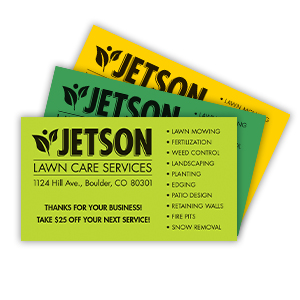
yellow green business cards ASTROBRIGHTS stock colorful printWhether things are still snowy in your area or it’s already a warm day, spring is a great time for your customers to embrace color in their print order. Vibrant color can help bring eyecatching style to print for upcoming events, capture attention for spring sales, and might even be something that becomes a favorite for year-round use. And while every print piece is a chance to print a colorful image, colorful stocks are another great way to bring vibrant color to their upcoming print orders. Here are just a few of the products that allow your customer to embrace colorful stocks and substrates.

Business Cards
In the past few years, we’ve introduced a number of ways to bring color to add vibrant color to business cards using stock choice, and these stocks are a great way to bring an extra pop of color to your customer’s spring print orders. Consider using color core stock that coordinates with their logo to create a substantial business card for important upcoming business meetings, and vibrant ASTROBRIGHTS® papers are a good choice for business cards with allover color. Speaking of these vibrant stocks…

Announcements and Postcards
A lot of the stocks we’ve introduced to our business card selection have also joined the stock selection for announcements and postcards. ASTROBRIGHTS® stocks make for eyecatching postcards, and that makes these postcards a great fit for attention-grabbing promotions for spring sales. Color core stock, on the other hand, has a subtler look that can add a touch of unexpected charm to postcards and announcements.

Badges and Signage
Does your customer love the classic look of engraved badges and signage? They should consider using a colorful stock! Because engraving gives your customer a wide variety of stock options, it’s easy for your customer to choose a stock color that appeals to them.

Promotional Products
When your customer is preparing for an upcoming tradeshow or other event where they will connect with prospective customers, promotional products are a great addition to their print order—and those promotional products are yet another chance to add color! Most promotional products, from pens and pencils to bags and water bottles, are available in a wide variety of vibrant colors.

Do your customers love colored stocks and substrates? We’d love to hear more about the colorful print options they love in the comments below.

How to Design a More Effective Brochure

Whether you design print pieces often or simply advise your customer as they create designs for their print pieces, making that design more effective is an essential part of ensuring that their print order shines. How can you help them design a more effective brochure? Here are our tips.

1. Know Your Folds
Trifold brochures are a classic for a reason, but there are a wide variety of other options that your customer should consider! They might prefer the simplicity of a half fold brochure, the unique look of an engineer fold, or the engaging look of a closed gatefold, or something else entirely. Each fold brings something different to your customer’s brochure, and the way that the piece is folded should be the foundation of any good brochure design.

2. Use Photos for Full Color Flair
From manufacturers looking to highlight the quality of their work to nonprofits looking to show the good that they do in communities, full color photographs are an ideal addition to brochures. Photographs help reinforce the text on the brochure and can be exciting, inspiring, and engaging all on their own.

And speaking of text…

3. Avoid Using Too Much Text
It can be easy to get too wordy on a brochure, but that might not be the most effective way to use text on a brochure. If your customer is creating a step-by-step guide with their brochure, they might want more in-depth text. However, if they are ordering a brochure to introduce new products or to give a preliminary guide to their business, keeping the text simple and short will work better.

Why is keeping it short a good idea? One of the biggest reasons is because it allows consumers to get the information they need at a glance. This will make it easier for your customer’s message to get across. It also makes it easier to keep the message clear—after all, when your customer has to focus in on just the most important information, there is less risk that their message will become muddled.

4. Use Headers
Whether you’re trying to create a compelling cover or guiding readers through the brochure itself, using a good title and headers for different sections can make a big impact. Not only do headers for sections of the brochure make it easy for readers to browse, they also help highlight your customer’s biggest points.

5. Include a Call to Action
What’s the next step? Does the person reading the brochure need to give your customer a call? Is your customer asking for a donation? Including a clear call to action to close out the brochure makes it easy to take that next step.

For more information about the brochure options that Navitor offers, check out our catalog or website.

What makes an effective brochure? Do you have any tips? We’d love to see you join the conversation in the comments below.

4 Creative Uses for Trading Cards

When you think of trading cards, the first thing that you think of is probably sports teams, but that’s only the beginning. With a little creativity, a trading card can be a great canvas for a wide variety of different small-scale print pieces. And, thanks to full color print, the design possibilities are nearly endless. Here are four of our favorite creative uses for trading cards.

1. Employee Profiles
When your customer relies on their employees relationships with their clients, printing employee profiles is a creative way to build a personal connection. This could be a good, informal way to introduce police officers to kids in the neighborhood, real estate agents to future homeowners, or individual salespeople to potential customers. Because a trading card features full color print, it can include a photograph as well as important contact information.

2. Celebrating Educational Milestones
Whether in a classroom or in an afterschool group, celebrating milestones is a good way to motivate students. Trading cards could be a creative way to motivate and mark their progress! One example would be to create a series of trading cards that will be given after a student passes tests on their multiplication tables in math class. Another example would be creating one for each monthly meeting for a new organization.

Trading cards are an especially good choice for this because they are lightweight but pack a big, colorful punch. Full color print can make them kid-friendly and colorful, and they can also serve as a reminder of previous lessons so that students can keep up their learning momentum.

3. Miniature Informational Pieces
They say that a picture is worth a thousand words, and a well-chosen picture on a trading card could speak volumes about new products or services! With a photograph and a product description, they are a good fit for a preview of new products or a high-level summary of what a new product can do.

If your customer has a short season for their sports team, a trading card could also make an excellent pocket-sized game schedules. Simply use a team photo or mascot image for the front of the card and personalize the back with a miniature version of the season’s schedule.

4. Something Different for Tickets
Does your customer want to create a ticket for their next event that will double as a keepsake long after the doors have closed? One eye-catching option is a trading card. Printed with artwork from event posters or performers’ photos, trading cards could be a fun, creative ticket option for plays, concerts, sports events, fundraisers, and more.

Ready to get creative? Click here to get started with your online trading card order or visit the marketing materials section of our catalog for more information.

Do your customers order trading cards for their business? How do they get creative with these print pieces? We’d love to see your suggestions for creative uses in the comments below.