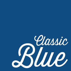
 Pantone, the leading authority in color, has announced their choice for color of the year in 2020: Classic Blue (PANTONE 19-4052)! A timeless and enduring blue hue is elegant in its simplicity and satisfies our desire for a dependable and stable foundation on which to build as we cross the threshold into a new era.
What Does Pantone Say?
According to Leatrice Eiseman, Executive Director of the Pantone Color Institute, this color is the constancy and confidence needed for the New Year. “We are living in a time that requires trust and faith,” says Eiseman. “Classic Blue, a solid and dependable blue hue we can always rely on. Imbued with a deep resonance, Classic Blue provides an anchoring foundation.”
Eiseman also says that the 2020 color of the year is a boundless blue evocative of the vast and infinite evening sky, Classic Blue encourages us to look beyond the obvious to expand our thinking; challenging us to think more deeply, increase our perspective and open the flow of communication.”
A Dependable and Stable Foundation in Design
Incorporating the color of the year into print and design is a great way to keep things focused and help bring clarity to your design, and “dependability” is the name of the game with this reflective blue tone. Its sense of peace and tranquility offers refuge to the human spirit.
If your customers want to pair Classic Blue with another color, they’re in luck. Pantone has a number of suggestions for color pairings when your customer is creating their print. From cool blue pairings and an array of warm and soothing shades to help induce a gently calming effect and feelings of peaceful tranquility to the human spirit.
Looking for a way to make Classic Blue even more special? Consider pairing it with a specialty stock or process! Consider pairing with Enhanced Finishes for another level of design.
A Color for All
Classic Blue is a great fit for many different industries, it’s a particularly natural fit for customers that need to convey dependability and stability in their business. From Healthcare to Banking and Finance the reassurance of Classic Blue will put their customer’s minds at ease.
What do you think of Pantone’s choice? Do you think your customers will want to use it in their print? Tell us about it in the comments below.
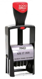 The New Year is rapidly approaching, so now is a good time to talk to your customers about refreshing their date stamps and embossers while they prepare to order other dated goods like calendars, planners, and appointment books.
 We’ve talked through marketing strategies for the rest of the year – now it’s time to plan for this winter! As the weather gets cold and, for many of us, snow becomes a constant topic of conversation, it provides an opportunity to start our planning with a blank canvas. Winter is the perfect time to regroup, set goals and much more. Here are our tips for creating a winter marketing strategy.
 The New Year is fast approaching, and that means it’s time for your customers to reorder the print pieces they rely on! Whether their print needs an update before 2020 or they want to freshen things up, it’s a great time for them to reorder the pieces they use every day. It’s also a good time for you to remind your customers of the products they might want before January. Here’s a checklist of the things your customers should consider reordering before the New Year.
 Are your customers looking for ways to increase their business success? Are you looking for a way to boost your bottom line? If so, FolderWorks™ has the answers to both of these questions! We are confident that our products, solutions, and services will deliver success for both you and your customers and provide you with the Best Folder Experience.
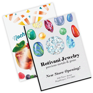 A personalized announcement delivers more than an invitation to a big event, holiday greetings, or thanks. It elevates your customer’s message to a new level, whether your customer is looking for a traditional announcement for their grand opening or a luxurious specialty announcement for their biggest events. Here are our tips for adding a touch of luxury to your customer’s print order.
 PackageWorks™ specializes in short-run quantities for the fast-changing retail market where niche brands, regional product introductions, and burgeoning “micro” markets demand high-quality packaging in smaller quantities.