5 Creative Holiday Uses for Business Cards

The holiday season is here, and your customers probably have a checklist. Send out greeting cards? Check. Decorate a tree? Check. Purchase gifts? Check. But have they considered adding business cards to their checklist?

The business card might seem like an everyday item—and it is a business essential for a reason—but it can also be a small canvas for big holiday plans. Because of the wide variety of stock options available for business cards and the variety of print options, business cards could be an ideal addition to your customer’s holiday season when they are used creatively. Even better, you’ll save instantly on business card shipping throughout December. Here are our five creative ideas for using business cards in the holiday season.
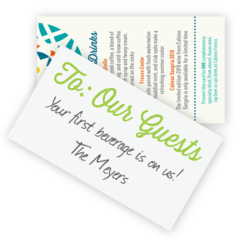
Drink Tickets
Is your customer hosting an event for the holiday season? Whether they are hosting a New Year’s Eve bash, celebrating the holidays with employees or hosting a fundraiser for a good cause, drink tickets could be a must-have element of the evening. Business cards make ideal drink tickets because they are pocket-sized and easy to personalize to match any event décor.

Gift Tags
Whether your customer is creating a gift for top clients, employees, or simply friends or family, a business card could be a creative gift tag option with flair. Not only can they easily be branded for your customer’s business gifts, but they can easily be taped or tied in place with ease. Gift tags can also be printed to match event décor to add an instant finishing touch to door prizes and gifts alike. – Check out our Shaped business cards for more ideas.

Coupons
Holiday sales and special offers are a hallmark of the season, and business cards make ideal colorful coupons that can be sent alongside invoices, scattered on tables at storefronts, or stacked by the register. Your customer could also give these coupons as a gift for customers who make holiday season purchases and to encourage them to start the New Year with another purchase.

Business Cards for Santa
Does your customer want to add an extra touch to Santa’s presence at their retail location? They should consider creating business cards for him! Full color print will make them festive, and these business cards could even point kids to a Santa phone number for an extra surprise.

Event Favors and Easy-to-Distribute Gifts
Is your customer looking for a lightweight favor or gift that they can give out at large events or send to a large group of their clients? Magnetic business cards are a fun option that is a colorful surprise they’ll appreciate now and may keep for weeks and months to come.

Want one more reason to order business cards for the holiday season? You’re in luck! Business cards and other Stationery items have 50% off shipping through December! These savings will be applied automatically for online orders. Be sure to place your order by December 31st to save.

Do your customers get creative with business cards during the holiday season? We’d love to see your creative uses in the comments below.

Is it Time for Your Customers to Reorder?

The New Year is fast approaching, and that means it’s time for your customers to reorder the print pieces they rely on! Whether their print needs an update before 2020 or they want to freshen things up, it’s a great time for them to reorder the pieces they use every day. It’s also a good time for you to remind your customers of the products they might want before January. Here’s a checklist of the things your customers should consider reordering before the New Year.

Stamps and Embossers
Stamps and embossers are some of the most common products that need to be reordered before the New Year. From notary stamps and embossers that require updating to dater stamps that end in 2018, freshening up your customer’s stamps is a good way to ensure that they have everything they need on January 1st.

Business Cards
Whether your customer has updated their branding or just wants to ensure that they have enough on hand, the end of the year is a good time for them to place an order for updated business cards. It’s a good time for customers to update these business essentials with new job titles, updated photographs, and other important details.

Promotional Products
If your customer’s tradeshow schedule is anything like ours, they’ll probably try to start the year strong with event attendance. This means that it is an essential time to update their promotional products! Not only does this give them a chance to replenish their stock after holiday giving, but it will also give them the chance to consider new promotional products for 2020. And, speaking of promotional products…

Calendars
Whether your customer keeps branded calendars in the office or wants to create a promotional piece that will last throughout the year, calendars are a great option. Ordering soon will ensure that they will give 365 days of marketing impressions.

Awards
The end of the year is also a great time to update awards. If your customers have an employee of the month program (or are looking to start one), the end of the year is an ideal time for them to make sure they have personalized plates for all of this past year and a new plaque for next year. Navitor’s cherry finish perpetual plaques let your customers reward their best employees every month and encourage other employees to work hard, too.

More information about Navitor’s wide range of useful products can be found on the Help and Resources page of our website. There, you can view all of our updated catalogs and see the new options and old favorites we currently offer.

Is it time for your customer to reorder? What print pieces are a yearly must-buy? We’d love to see you join the conversation in the comments below.

Should Your Customer’s Stock be Sturdier? The Benefits of Bringing in a Heavyweight

Your customer has a lot of stock options to choose from when creating their print piece. Do they want something lightweight and budgetfriendly, or do they want to invest in something heavier? With so many options to choose from, it’s important for them to know the benefits of investing in a heavier stock—that’s why we’re breaking down the benefits of using a thick or sturdy stock for business cards, postcards, announcements, and more.

Benefits By the Numbers
What do statistics say about the importance of heavyweight papers? According to WestRock, they had had a lot to say. Their research indicates that, when it comes to direct mail pieces, thicker and sturdier stock definitely wins out.

  • 18% of consumers said that their intent to purchase would be impacted by receiving a sturdier piece of direct mail
  • National retailers with sturdier paper saw a 38% response rate

Getting Noticed
Thicker stocks aren’t just great for postcards—they’re a surefire way to get a wide variety of print pieces noticed! One of the reasons for this is that thicker stock makes your customer’s print piece sturdier and more durable than thinner pieces.  When they choose a durable stock, their print pieces will last longer and stick around in consumers’ wallets or mailboxes.

The Unexpected Touch
Unexpected details are always the thing that makes a print piece memorable, and stock could be the unexpected detail your customer is looking for. Imagine pulling out a stack of business cards from a trade show, for example—a pop of color from a color core stock will be immediately noticeable. Even if it’s not a color core stock, the thickest and most substantial business card will be among the first that gets noticed among the stack.

These unexpected touches don’t just get business cards noticed. We mentioned earlier that direct mail is more effective when printed on a sturdy stock, and announcements will have a memorable, luxurious feel when printed on a heavier stock.

Know Your Options
Are your customers ready to bring in a heavyweight? It’s time to introduce them to their options. Many of our cover stocks have a substantial feel, and you can check out color core and extra thick stocks for a thickness that truly stands out from the crowd. The best way for your customers to feel the difference is to see them in person, so be sure to show them samples or pull out a swatch book. If you don’t have one yet you can give our customer care team a call to request yours.

Do your customers love heavyweight stocks? Which ones are their favorites? We’d love to see you join the conversation in the comments below.

Matte Finishes are Anything But Dull!

matte gold foil on a legal business card
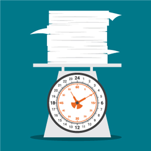
Matte finishes are back on trend, and your customers should consider them for their next print piece! Whether they love the look of an uncoated stock or are looking for a subtle touch of metal without a high gloss shine, matte finishes, here are just a few of the reasons your customers should use matte finishes for their next print piece.

Uncoated Stocks Let Texture Shine Through
If your customer is looking for a classic, elegant look, uncoated stocks bring their texture to the forefront! The texture of an uncoated stock gives it a handmade, tactile appeal that feels high end.

Uncoated stocks give your customers a variety of other benefits, too! They are easier to write on, so if your customer is hoping to include a handwritten note on their business card or to sign their announcements by hand they might want to stick to uncoated stocks. Your customer can also be sure that their print piece will look cleaner because fingerprints and smudges won’t show up after their print piece has been touched.

Uncoated Stocks and Color
In matte prints, colors are slightly more muted, giving colors and images a more natural feel. While vibrant hues are a great option for some customers, these subtler colors are a good fit for print pieces with a more muted color palette. This also gives a print piece a more classic feel instead of the sleek look of a coated stock.

Matte Foils are Subtle and Elegant
When your customers think of foil, they probably think of a shiny finish first and foremost. However, they can also choose foils that give them the look of classic gold or silver in a matte or dull finish. Our graphic designers recommend dull foils especially for markets that value a subtle and classic look with high end flair: law firms, financial institutions, and other well-established businesses.

Matte foils also add another benefit: readability. Because there is no glare on a dull foil, they are easier to read and keep your customer’s message and branding in the forefront.

Dull Foil for Designer’s Choice!
Like we mentioned before, when we talked to our team’s graphic designers they had a lot to say about the love of matte finishes. They said that they prefer dull foil because they find it more attractive and more subtle. They also said that dull foil stands out because many printers don’t offer it as an option and as a result it’s a less common finishing touch for business cards, announcements, and other print pieces.

Do your customers like matte finishes? Or do they prefer something shinier? We’d love to see you join the conversation in the comments below.

Coming Soon to Navitor.com: Glitter Stock!

Are your customers ready to try something new? Have they been looking for an eyecatching stock that will get them noticed? Do they want to add a touch of luxury to their print order?

Have we got news for you!

Coming soon to Navitor.com is Crystal White Glitter Color Core stock. This new addition pairs the heavyweight thickness and unexpected pop of color that comes from color core stock with the sparkle of a glittered surface! Here’s what you need to know about this new option for announcements, business cards, and postcards.

Get to Know the Sparkle: Crystal White Glitter
The crystal white finish of our glitter stock is more than just sparkly. It has a subtle, iridescent look that adds depth and visual interest to the glitter finish. And we are pleased to note that the glitter stays put on the stock’s surface—this means that it won’t lose its sparkle before it’s been handed to the customer.

The glitter also adds a textured surface to any business card, announcement, or postcard that uses glitter stock, adding an extra touch of tactile appeal. This means that when a design features heavy ink coverage and the glitter itself is covered by that ink, there is an appealing textured surface on those areas.

We are debuting Crystal White Glitter as a color core stock, so not only will your customer’s print order include a striking touch of sparkle but it will also feature their choice of five colored cores. And because of the colored core, Crystal White Glitter Color Core stock will weigh in at an impressive 45pt. thickness that is sure to stand out from the crowd.

Truly New!
We understand that your customers want to stand out, and that’s why we’ve brought glitter stock into our offering! It’s truly new to the personalized print market and will make your customer’s business card, announcement, or postcard stand out even more because of that.

Want to know more? Before this new stock goes live on Navitor.com, you can click here to download a free PDF flyer for more information. Be sure to update your email subscriptions, too, so that you won’t miss out on the email when this new stock is available for purchase.

Are you excited about our new Crystal White Glitter Color Core stock? Do you have customers who have been looking for that bit of extra sparkle? We’d love to see you join the conversation in the comments below.

Doing More With Less: Creating Great Minimalist Design

do more with less minimalism for personalized print typography
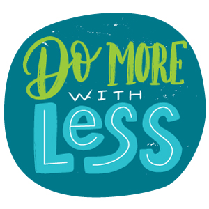
Minimalism has been on trend for some time, and if your customers come to you to ask for your design advice you want to create something eye catching. If what they’re looking for is minimalism, you need to ensure that your design does more with less. Here are our tips for achieving great minimalist design.

Highlight What’s Most Important
Minimalist design relies on choosing only the most important details and leaving the rest behind. If you’re creating a design for your customers, be sure that they pick the information that’s essential. For event invitations, that’s the information necessary for RSVPing and attending. For a business card, that’s your customer’s essential contact information. Use those details as the foundation of the design.

And stick to what’s most important in terms of color, too! Focus on your customer’s brand colors or the colors for their event to ensure that their minimalist design contributes to a cohesive overall look.

If you’re looking for some design inspiration, check out this post from 1st Web Designer to look at some eyecatching minimalist business cards.

Embrace the Unexpected Detail
Sometimes, an unexpected detail is what you need to make minimalism really work for your customer’s print order. A touch of spot gloss or raised print can add unexpected texture. A heavyweight stock can catch attention immediately. A pop of bright, branded color in an otherwise muted business card will stand out all the more because of the minimalist design.

Choose Just the Right Stock
Because minimalist design is focused on only the most important details, your customer’s stock choice is even more important. Minimal designs let the space around the text do much of the talking—and that can make an impact that’s anything but minimal! Minimalist designs allow the texture of the stock to take center stage, whether the stock is smooth and sleek or features a subtle texture with handmade appeal.

Stock can also be the source of those unexpected details I mentioned before. A subtle shimmer from a pearlized stock adds a luminous touch. An extra thick stock has a surprising heft when held. And for an additional pop of color, consider color core stock.

Consider The Print Process
Minimalist design is also a chance for your customers to use print processes that add an extra touch of professionalism to their design. Full color print is a great option for many customers, but when your customers are interested in minimalist design they should consider the many other options available to them.

Thermography is a great place to start. Whether paired with full color print or spot color, thermography adds depth and texture to your customer’s design. That texture can add a lot of interest to their print piece.

Speaking of depth, for a truly extraordinary finishing touch, consider enhanced finishes. Spot gloss and raised spot gloss can be used to enhance your customer’s minimalist design or on their own for a subtle, shiny look. Raised foil creates a classic metallic look with style.

Do your customers love the look of minimalism? What details are their favorites? We’d love to see you join the conversation in the comments below.

Print to Add Polish to Nonprofit Fundraisers

Nonprofits of all sorts will soon be hosting the last outdoor fundraisers of the year, and just as soon they will be preparing for the events they host at the end of the year. When they’re planning their events, they should also be planning the print that adds a great finishing touch to their fundraisers. Here are our choices for the print pieces that will add profit to your customer’s next nonprofit fundraiser.

Posters
Are your customers trying to get the word out to a wider audience? Posters could be the best way to raise interest in their community events! And with a variety of quantities available, posters could also be a colorful addition to event promotion even in smaller communities.

Announcements and Postcards
Some of your customers’ events focus on previous donors or top donors, and announcements and postcards are a great way to add polish to those event invitations. Choose postcards for a more informal feel, or use announcements to make the occasion feel a little extra special.

Brochures, Rack Cards and Sales Sheets
Whether your customer wants to include them with a mailing or wants a piece to show donors what their gifts will be doing, informational pieces are an essential way to get the word out about the good work that they do. Brochures, rack cards, and sales sheets are classic pieces that can include text to show off essential statistics or photographs that highlight the people who benefit from a nonprofit’s work.

Event Tickets
If your customer is hosting a raffle or fundraising event, event tickets are essential! These tickets feature practical details like perforated ends for easy raffle use and numbering to make it easy to keep track of attendees. Even better, when your customer chooses full color print they can help make their nonprofit’s branding more memorable.

Folders
Whether it’s organizing instructions for volunteers, putting together forms and information for donors, or keeping documents organized afterward, branded folders are a good way to keep organized. As a bonus, using branded folders is a good way to add that extra touch of professional polish to every document.

Badges
Speaking of event volunteers, badges are a great way to show which people at your customer’s event are working and which are simply attending. Choose labels as temporary name tags for events with a lot of short-term volunteers, or consider window badges, chalk badges or erasable badges  for flexible badges that can be used at event after event.

Banners, Signs and Other Décor
Once your customers are actually at their event, indoors or out, it’s time to personalize the space. Banners are a great fit for events indoors or out, adding a splash of color in your customer’s choice of a variety of styles. Freestanding a-frame signage can guide attendees through buildings, personalize stages and accent sidewalks outside outdoor event venues.

Do you work with customers in the nonprofit sector? Which print products are their favorites? We’d love to see you join the conversation in the comments below.

Spectacular Spot Gloss: What You Need to Know About Designing for this Enhanced Finish

Whether flat or raised, spot gloss is a finish on the rise, and for good reason! This Enhanced Finish is becoming a popular option for a variety of print pieces, and it can be an excellent addition to your customer’s business card, announcement, or postcard. However, the real strength of spot gloss and raised spot gloss are in the design. Here’s what you need to know about creating spectacular spot gloss.

Having Your Formatting Right is the Foundation of Great Design
Great design starts with great execution. That means having your fonts correctly sized, using the right file and color formats—and, for spot gloss and raised spot gloss, taking a look at our instructions for file creation. Having these basic guidelines in mind will help ensure that your design choices are executed perfectly, making your whole design more impressive. Click here to download our design guidelines, or take a look at our youtube video if you’re more of a visual learner.

And don’t forget about the option to bring spot gloss to new heights. Raised spot gloss can be used in a similar way to spot gloss, but with extra depth added to the shiny accent. It’s a slightly different look—and an interesting, tactile texture—that your customer should consider for their print pieces.

Do You Want Your Spot Gloss to Stand Alone or Make Details Stand Out?
Gloss is a particularly versatile finish because of the sheer number of ways that it can be used—emphasis on “sheer”! Because spot gloss and raised spot gloss are transparent, they can be used to create a wide variety of different looks.

Spot gloss can be used on its own or over a flood coat to create a subtle design element. This option will appeal to customers seeking a minimalist look for their business cards, but it can also create stylish patterns, interesting borders, or subtle text.

When paired with a full color design, on the other hand, spot gloss and raised spot gloss can highlight different bits of the design. Be strategic about the design. Spot gloss can be used as a glossy accent on the most important word of a message or to add a luminous quality to elements of an image like the stars in a night sky or the fire in a fireplace.

What Does Your Customer Want to Emphasize?
Whether it’s your customer’s brand colors, their logo, or a particular part of their marketing message, spot gloss can be an unexpected detail that helps emphasize what’s essential. An unexpected touch of spot gloss in the shape of their logo can be a memorable way to change things up. Using spot gloss or raised spot gloss over the most important part of their message on a postcard can ensure that message is noticed.

Would Coated Stock Be a Better Choice?
If your customers are excited about spot gloss, we understand the temptation to use it everywhere, but it really works better as an unexpected accent. If your customer wants a lot of shine for their piece, they might be better off using a glossy coated stock and leaving spot gloss for a special occasion.

Have your customers ordered spot gloss or raised spot gloss? How have they made sure that their design is extraordinary? We’d love to see you join the conversation in the comments below.

Bringing in a Heavyweight: Navigating Paper Weight and Thickness

When your customer is creating a print piece, often their stock choices are one of the biggest factors in how that project fits into their budget. With stocks labeled with both points and pounds, though, it can be tricky to decode what these labels mean. Luckily, we’re here to help! Here is a little advice on navigating lightweight stocks, heavyweight stocks, and everything in between!

Pound vs. Point
Two of the most common measurements for paper are pound (lb.) and point (pt.), but it can be challenging to know what this stock information means. What really makes these measurements difficult to navigate is that they are literally measuring different aspects of paper.

Pound is a measurement of how much a one ream of a paper stock weighs; weights range from 20 to 80 pounds for bond paper and 50 to 140 pounds for card stock. Point is a measurement of the paper’s thickness, with each pt. equal to .001 inch—14 pt. paper, for example, measures in at .014 inches thick.

With both of these measurements, though, you can be sure of one very important thing: the bigger the number, the more heft the stock will have.

How Do These Stocks Measure Up?
Unfortunately, it can be hard to match up thicknesses and weights because the measurements simply aren’t easy to translate. For example, 12 pt. cardstock weighs in at approximately 100 lb., but they aren’t exactly the same thickness. Your best bet is to focus on the type of paper first and the weight or thickness afterward.

This confusing set of measurements also means that your customers might have a hard time visualizing the stock thickness when they’re just reading numbers. After all, unless they are looking at stocks that are both measured by weight, the comparison is a challenge. That’s part of why swatch books are so important to have on hand when you’re making a sales pitch—they allow for easy stock comparisons.

Keep an Eye Out for New Heavyweight Champions
We know that many customers are looking for heavier paper options—that’s why we’ve got exciting new stock options coming soon! Keep an eye on your inbox for news about new stock options in a variety of different weights. And, if you’re not signed up to get Navitor’s emails, take a moment to sign up or update your email preferences.

Do you have any other questions about how to navigate stock choices? We’d love to see you join the conversation in the comments below.

Designing an Extraordinary Business Card

When everything works—from the print design to the stock choices—a business card can be a key part of making a great first impression. And if your customers are coming to you for advice on their business cards, considering all elements of the design can help ensure that their business card is striking. Here are our tips for designing a business card that is truly extraordinary.

Remember Your Design Principals
Good design starts with the basics, so keeping those basics design recommendations in mind is an ideal foundation for designing a great business card. Keep important information and images at least 1/8 inch from the trim edge, work at 300dpi for a clear image, use CMYK for full color print, and ensure that your fonts are above the minimum size to ensure that the card is legible.

Change it Up
A memorable business card is often a business card that stands out, and that’s why it can be a great idea to change things up. If your customer’s business card design features rounded shapes, for example, choosing rounded corners for their business card can help their card stand out from the square-cornered crowd and reinforce the look of their design. A vertical business card can also be a great way to change things up.

Keep it Simple
A business card is a great canvas, but it’s also a small canvas—don’t oversaturate it with information! Talk to your customer about the information that absolutely needs to be included and focus on the details that will be most relevant to a potential client.

Talk To Your Customers About Stock
A great design can be made even better when it’s printed on a great stock, so be sure to talk to your customers about how their stock selection might impact their design. A bright white will give them the truest color, while an ivory or ecru will soften the colors slightly. They can use a specialty stock like pearlized stock to add a shining dimension to the design, or they can add an accent color with color core stock for an added visual pop.

And speaking of business cards, keep an eye out for more exciting business card options coming soon from Navitor. Click here to adjust your email preferences to ensure that you receive news about new options that will help your customer’s business card order truly extraordinary.

What do you think makes a great business card design? We’d love to see your recommendations in the comments below.